
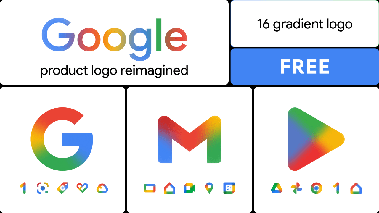
So this week, Google started rolling out a full gradient redesign across its Workspace suite. Gmail, Drive, Docs, Sheets, Slides, Calendar, Meet, Chat, Vids, Forms, Keep, Voice, Tasks, yup, basically everything. The rollout kicked off May 18, conveniently right before Google I/O, and it's showing up first in the web app launcher and on iOS and Android home screens.
.png)
And mind you, this isn't a small tweak. The flat, four-color outline logos that have haunted Workspace for the past five years? Gone. In their place: softer shapes, rounder corners, distinct colors per app, and a glowy gradient finish that one designer hilariously described as looking like the icons were run through a watercolor filter.
.png)
Take Drive's new icon: red is just... gone. It's green, yellow, and blue now, which (ah, yes) actually matches the three editor apps it houses. Makes sense, right? Sheets and Slides have flipped to landscape orientation, a tiny detail, but a really clever one, because that's literally how the apps behave. Gmail keeps all four colors, but it's the only one, and even then the envelope got rounder and friendlier. None of this is actually cosmetic.
Rather, the way I see it, it's Google quietly correcting a hierarchy mistake: brand consistency had been winning the fight against user recognition, and somewhere along the way they realized, yeah, that's backwards.
Why Now?
Google didn't just fix the legibility problem. They fixed it in a very specific aesthetic direction. Gradients. Glow. Depth. The same visual language they're already using on the Google "G," Gemini, Maps, Photos, Home.
If you think this is a coincidence, you are too naive. It's the AI-first aesthetic, and it's quietly becoming Google's house style now. Apple's doing the same thing this year with Liquid Glass, by the way. The whole industry is moving away from the flat, geometric, post-2015 look because flat design was the visual vocabulary of mobile-first software. Gradients and depth are the vocabulary of intelligent, responsive, generative software. Whether that mapping is "real" or not doesn't really matter but it does create a very solid signaling effect. Google wants you to feel the Gemini layer underneath every Workspace app, even when you're just opening a boring spreadsheet.
And there's a quieter strategic read here too, which I think people are missing. Google has spent the last 18 months in a weird existential bind. They own the productivity stack but are losing the AI narrative to OpenAI and, increasingly, Anthropic. You can't out-ship a narrative with a new icon set. But you can make sure that every time a user opens Gmail or Docs, the visual cue whispers "this is alive, this is intelligent, this isn't the same tool you used in 2020." Icons are weirdly load-bearing for this. They're the most-seen pieces of brand real estate Google owns. Way more than the homepage. Way more than any ad campaign as people look at these things dozens of times a day, and subconsciously register them and don't even realize the kind of understanding they are developing from it.
The thing I'd actually watch for next?
Whether this aesthetic creeps into the apps themselves. Right now the editors still look like old Workspace. By old I mean the flat, sterile, very 2020 feel. But if those gradients, rounder corners, and warmer tones start showing up inside Docs and Sheets the way they did inside Gemini... then this was literally the visual onramp to a much bigger UI rewrite. And that's something, at least I am very interested in.
Let's see.